How To Combine Cabinet Colors To Create Luxury
How to combine cabinet colors to create luxury is an art that elevates your kitchen from a functional space to a sophisticated statement of personal style, and at rtadepot.ca, we provide the perfect palettes and custom solutions. Harmonizing cabinet colors unlocks a premium design, transforming your home into an organized and aesthetically pleasing sanctuary with our upscale two-tone cabinet combinations. Explore our guide to elegant kitchen color schemes.
1. The Power of Color in High-End Kitchen Design
The journey to a luxury kitchen begins with color. More than just a visual element, color has a profound psychological impact, influencing mood and perception of space. A well-designed color palette can make a compact Toronto kitchen feel expansive, turn a dim room into a bright and inviting hub, and establish a sophisticated atmosphere. According to recent data from real estate and design publications like Forbes, a thoughtfully renovated kitchen can increase a home’s value significantly, with color choice being a primary factor in its perceived value and buyer appeal.
At rtadepot.ca, we understand that selecting the right hues is the foundation of creating a lavish feel. It’s not about using the most expensive materials, but about the artful blending of cabinet shades to create a cohesive and elegant design. A strategic combination can highlight architectural features, create a focal point, and reflect natural light, contributing to an environment of refined comfort. We help you move beyond fleeting trends to select timeless, coordinating cabinet tones that resonate with your home’s character and your personal aesthetic.
2. What Are The Foundational Rules for Harmonizing Cabinet Colors?
Short Answer: The key to harmonizing cabinet colors lies in applying established interior design principles. The most effective rules are the 60-30-10 principle for color proportion and using a color wheel to identify complementary, analogous, or monochromatic schemes that create a balanced and luxurious feel.
Achieving a deluxe look by combining cabinet paints and finishes is guided by these established design principles. Understanding these rules provides a framework for making confident and beautiful choices. Whether you are aiming for subtle sophistication or a bold, dramatic statement, these guidelines ensure a balanced and harmonious outcome, turning a simple color choice into an intentional design statement.
2.1 The 60-30-10 Principle
A classic rule in interior design, the 60-30-10 principle is perfectly suited for creating a balanced kitchen palette. This guideline ensures that the colors are properly proportioned, creating a visually appealing and uncluttered look. It provides a simple mathematical framework to prevent a single color from overpowering the space or the overall design from feeling chaotic.
- ✓60% Dominant Color: This is the main color for your cabinetry, covering the largest visual area. It sets the overall tone of the kitchen.
- ✓30% Secondary Color: This is your accent cabinet color, often used for an island or the upper/lower set of cabinets. It should complement the dominant color.
- ✓10% Accent Color: This is typically reserved for hardware, fixtures, and decorative items, adding a final touch of personality and polish.

2.2 Leveraging the Color Wheel
The color wheel is an essential tool for creating sophisticated cabinet color pairings. It helps you understand the relationship between different hues to create a specific mood.
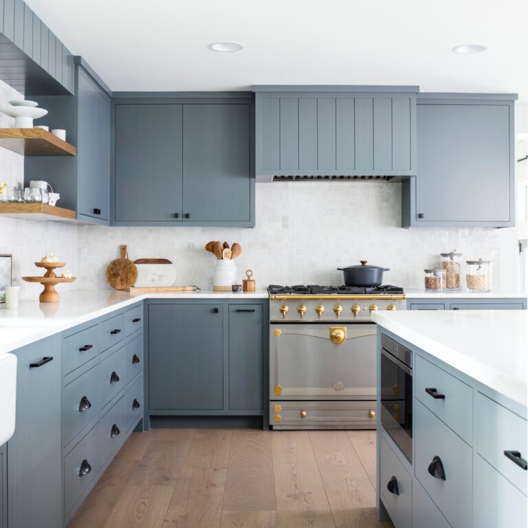
- ✓Complementary Colors: Hues opposite each other on the color wheel, like blue and orange, create a vibrant, high-contrast look. In a kitchen, this might translate to deep navy cabinets with warm brass hardware.
- ✓Analogous Colors: Colors that are next to each other on the color wheel, such as blue and green, result in a more serene and cohesive feel. This approach is perfect for layering cabinet colors for a rich aesthetic.
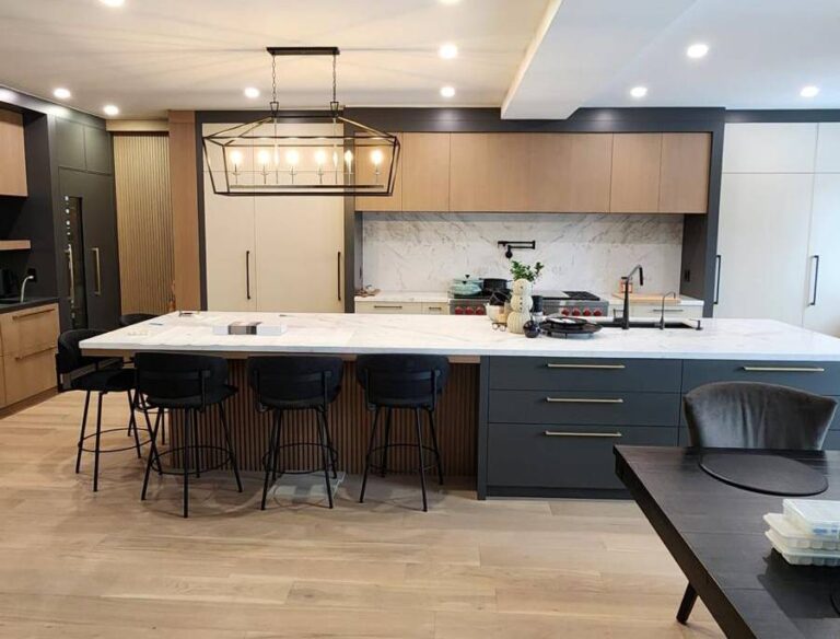
- ✓Monochromatic Schemes: Using various shades, tones, and tints of a single hue creates a sleek, modern, and unified space.
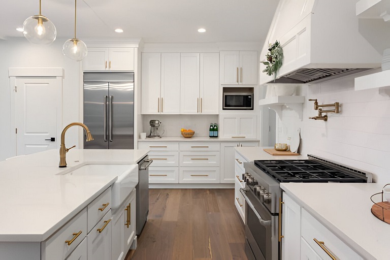
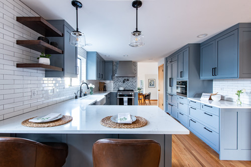
3. What Is The Best Way To Pair Upper and Lower Cabinet Colors?
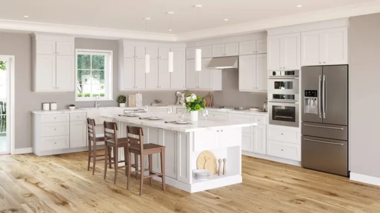
Short Answer: The most effective and popular strategy is to use a lighter color for the upper cabinets and a darker, grounding color for the lower cabinets. This pairing makes the space feel larger, brighter, and more open by drawing the eye upward.
This two-tone approach is a hallmark of contemporary luxury, adding depth and character. The 2024 U.S. Houzz Kitchen Trends Study confirms this, noting that two-tone cabinets remain a significant trend. Using lighter uppers, like soft white or cream, reflects more light and creates an airy feel, while darker base cabinets in shades like navy blue or forest green provide a solid, sophisticated foundation. This is an especially effective strategy for optimizing the aesthetic in city homes where space can be limited.
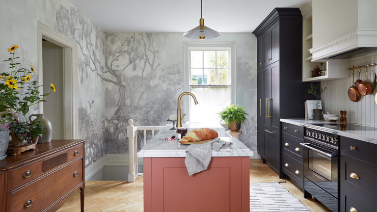
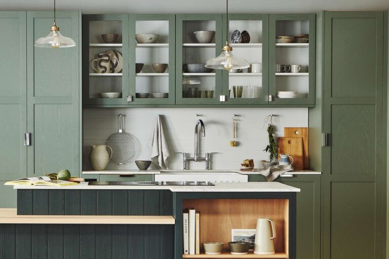
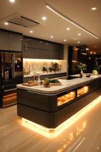
3.1 The Statement Piece: Contrasting Kitchen Island Colors
Using the kitchen island as a contrasting element is a powerful way to create a focal point. According to the same Houzz study, over 40% of renovating homeowners choose a contrasting color for their island cabinets. This allows you to introduce a bold color without overwhelming the entire space. For many luxury cabinet color palettes for kitchens in Toronto, a contrasting island serves as the centerpiece that ties an entire open-concept living area together, making the island more than a workspace, but a piece of statement furniture.
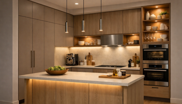
4. Material and Finish: The Unspoken Element of Luxury
The material and finish of your cabinets play a critical role in how colors are perceived. The same shade of gray can look vastly different in a high-gloss finish versus a matte or wood-grain texture. Mixing two-tone cabinet finishes for a sophisticated feel is an advanced technique that adds another layer of custom detail.
- ✓High-Gloss Acrylic or Lacquer: These finishes reflect light beautifully, making spaces feel brighter and more modern. They are perfect for achieving a sleek, minimalist aesthetic.
- ✓Matte Finishes: A matte surface absorbs light, creating a soft, velvety look that exudes understated elegance. This finish is excellent at hiding fingerprints and smudges.
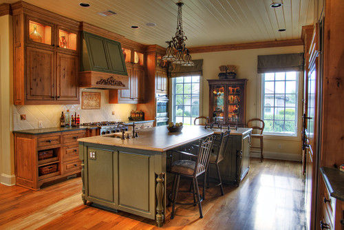
- ✓Wood Grain: Whether painted or stained, the natural texture of wood adds warmth and character. The Houzz report also indicates a rising popularity of wood tones, often paired with painted cabinets for a rich, textural contrast.
At rtadepot.ca, our design experts guide you through these choices, helping you harmonize not just colors but also textures and finishes to achieve a truly cohesive and opulent look.
5. The rtadepot.ca Advantage: Your Partner in Creating Luxury
Are you tired of your outdated cabinets, struggling with cluttered countertops, and finding it difficult to locate a high-quality, custom solution that fits your unique space and budget? You are not alone. These are the challenges that rtadepot.ca was created to solve. We specialize in transforming kitchens by providing durable, beautiful, and highly functional cabinetry that bridges the gap between standard and fully custom.
Our process is designed to empower you.
- ✓Personalized Design Consultation: Our team works with you to understand your needs, from optimizing storage in a compact city home to upgrading the aesthetic of your entire living space.
- ✓Durable, Long-Lasting Solutions: Our cabinets are built to last, featuring high-quality materials and finishes that are easy to clean and maintain, ensuring your kitchen remains beautiful for years.
- ✓Flexible Assembly and Installation: We offer premium ready-to-assemble (RTA) cabinets designed for straightforward installation, as well as access to professional installation services for a completely worry-free experience.
Ready to Transform Your Kitchen?
Your current kitchen may be outdated and inefficient, but your dream of an organized, beautiful, and luxurious space is within reach. Do not let the challenge of finding a high-quality, affordable custom solution hold you back any longer.
Imagine a kitchen where every item has a place, cooking is a joy, and the color palette perfectly reflects your sophisticated style. At rtadepot.ca, we make this vision a reality.
Take the first step towards the kitchen you deserve. Our design experts are ready to provide a personalized consultation to help you select the perfect cabinet color combination.
Call Us Now for Immediate Assistance: +1 888 973 5636
Explore Our Collections at: https://www.rtadepot.ca/

Sang Vi is a Senior Interior Designer and founder of Wedesign Interior Lab, as well as CEO of the Wedesign Interior Lab, MOC Concepts (Kitchen Cabinets), and Sang Vi Woodworking Manufacturer group. Since 2019, Sang has led an NKBA-certified team specializing in kitchen planning and cabinetry, completing dozens of projects each year across Toronto and other regions in Canada. With deep, hands-on experience in both custom millwork and ready-to-assemble (RTA) kitchen cabinets, Sang focuses on creating designs that are functional, durable, and easy to install. On this RTA platform, Sang shares practical, real-world insights to help homeowners choose, plan, and optimize their kitchen cabinet systems with confidence.