
Updated August 21, 2026. Reviewed for search intent, claim accuracy, internal links and current Canadian renovation planning.
Outdated Does Not Mean Automatically Wrong
Colour advice should account for natural light, flooring, countertops, room size and the age of the home. Navy, white or oak can still look excellent when the undertone and surrounding materials are coordinated. The problem is usually an inflexible whole-room application, not the colour name itself.
| Higher-risk choice | Why it can feel dated | More flexible direction |
|---|---|---|
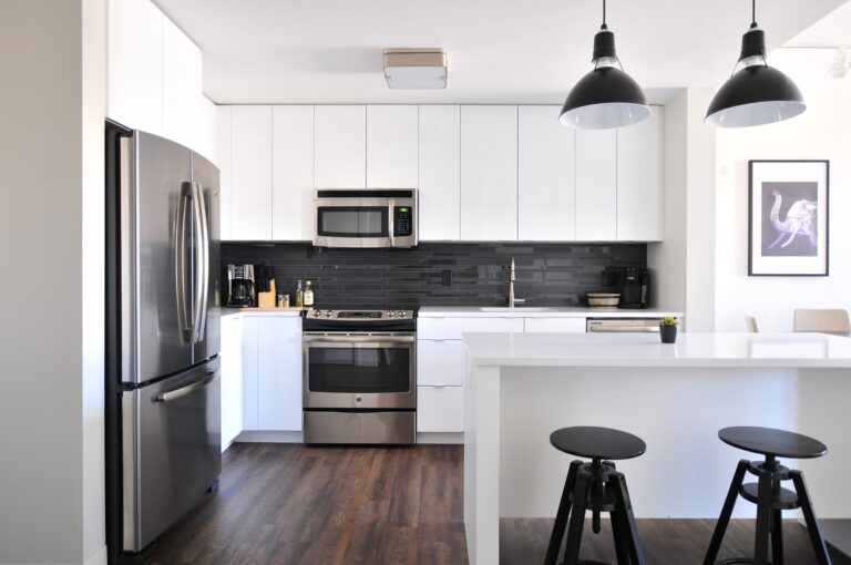
| Stark blue-white | Can feel cold beside warm floors and stone. | Warm white, ivory or a white matched to the countertop undertone. |
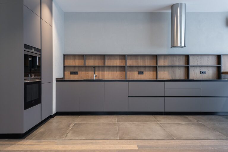
| Cool flat grey | May make a low-light room feel dull. | Greige, mushroom, taupe or a restrained warm grey. |
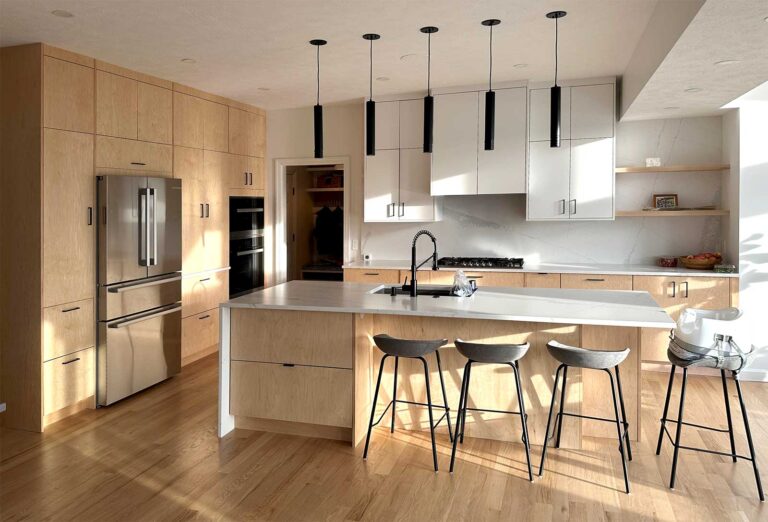
| Orange honey oak | The orange cast can fight newer stone and flooring. | Natural white oak, medium brown stain or a toned-down refinishing system. |
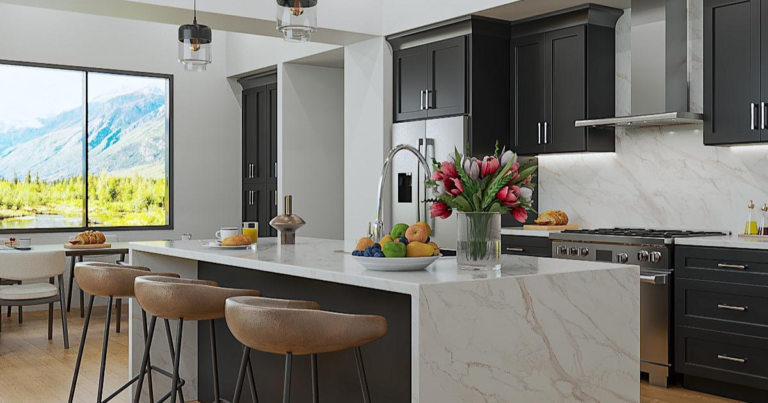
| Full-room navy | Can absorb light and dominate a compact kitchen. | Use navy on an island or lower run with lighter surrounding cabinetry. |
| Pastel mint | A candy-like undertone can date quickly. | Muted sage, olive or grey-green. |
| Mustard yellow | Large saturated surfaces can overwhelm fixed finishes. | Ochre accents, warm cream or natural wood. |
| Red cherry stain | Strong red undertones can clash with cool counters and floors. | Neutral brown, walnut-inspired or lower-sheen refinishing. |
1. Stark White: Keep the Light, Add Warmth
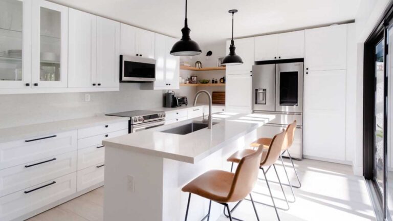
Bright white is useful in small or dim kitchens, but a blue-white finish beside beige tile, cream stone or warm wood can look disconnected. Compare warm-white samples against every fixed surface. If the room already has a crisp black-and-white palette, stark white may still be the right choice.
2. Cool Grey: Replace Flatness With Undertone
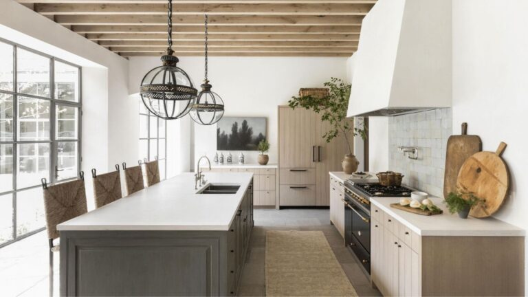
Grey cabinetry is most likely to feel dated when it has no relationship to the floor or countertop. Warmer greys, greige and mushroom finishes are easier to combine with natural wood and stone. Do not select a replacement from a screen; view a physical door sample in daylight and evening light.
3. Orange Honey Oak: Correct the Finish Before Replacing the Wood
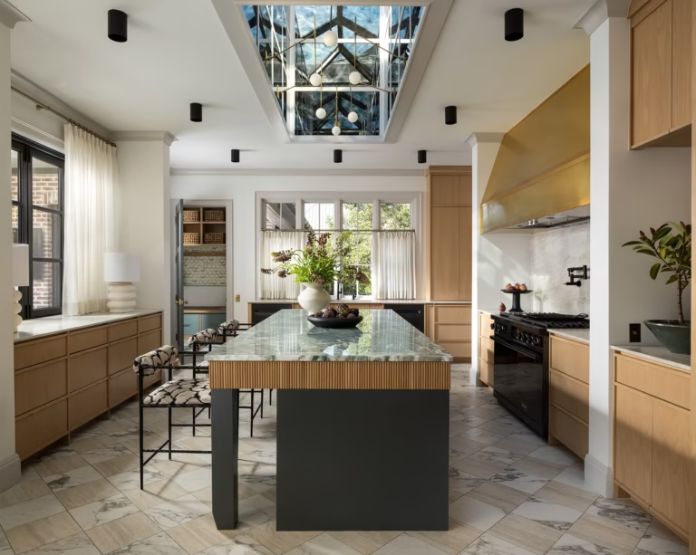
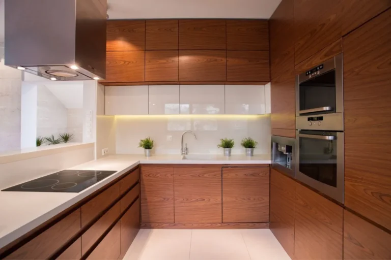
Oak grain itself is not obsolete. The dated effect usually comes from a glossy orange stain, heavy cathedral grain or ornate door profile. A professional refinishing test, new hardware and a simpler surrounding palette may retain usable cabinetry while reducing the orange cast.
4. Navy Blue: Use It as a Controlled Anchor
Deep blue can still work on an island, pantry wall or lower cabinets. In compact rooms, balance it with lighter uppers and adequate task lighting. Repeat the blue once elsewhere so it reads as deliberate rather than isolated.
5–7. Mint, Mustard and Red Cherry: Reduce Saturation
Highly saturated mint, mustard and red-cherry finishes demand that every nearby material cooperate. Muted green, warm cream and neutral brown alternatives keep the character while making future countertop, hardware and paint updates easier.
Cabinet Colour Test Before You Order
- Photograph and list every fixed surface: floor, countertop, backsplash and appliance finish.
- Borrow or order full-size door samples rather than relying on a small paint chip.
- View samples vertically in morning, afternoon and evening light.
- Compare cleaning visibility, fingerprints and touch-up availability.
- Approve one dominant cabinet finish and no more than one controlled accent.
Next, compare the broader modern kitchen cabinet selection guide before committing to a colour-led renovation.
Sources and planning references
These trend references are directional. A cabinet colour still has to be tested against the actual room, fixed finishes and lighting.