How to Choose the Best IKEA Kitchen Cabinet Colors for Your Space: A Professional 2026 Guide
How to choose IKEA kitchen cabinet colors for your space is a critical decision in the 2026 home renovation landscape, where the kitchen has evolved into the emotional and digital heart of the home. For homeowners from the high-density corridors of downtown Toronto to the expansive suburbs of Mississauga, selecting the right palette is a multi-thousand-dollar strategic move. A color choice affects not only the morning mood of the inhabitants but also the long-term resale equity of the property.At RTA Depot, we treat the IKEA SEKTION system as a high-performance “skeleton” that can be dressed to reflect either budget-conscious pragmatism or ultra-luxury custom aesthetics. As of April 2026, the IKEA kitchen cabinets cost for a mid-to-large-sized kitchen in Ontario typically sits between $6,200 and $17,500, making the palette selection one of the most visible investments you will ever make. This guide provides an exhaustive IKEA kitchen cabinet color guide to help you master the nuances of light, material, and coordination.1. The Science of Light: Why Your Showroom Choice Changes at Home
Most IKEA cabinet color selection tips overlook the physical orientation of the home. In 2026, we categorize lighting impact into four distinct quadrants based on the Greater Toronto Area’s seasonal shifts:Direct Answer: Lighting temperature (measured in Kelvin) and the Compass Orientation of your kitchen can shift a cabinet’s perceived color by up to 35-40%. Understanding how to choose IKEA kitchen cabinet colors requires mastering “Metamerism”—the phenomenon where two colors match under one light source but not another.
The Compass Influence (GTA Standard)
- North-Facing Kitchens: These spaces receive a weak, bluish natural light. Dark colors like “Sinarp” or “Lerhyttan Black” can feel cavernous here. If choosing IKEA kitchen cabinet finishes for a North-facing room, always opt for warm undertones (creams, sands, or warm oaks) to counteract the blue tint.
- South-Facing Kitchens: These receive intense, warm light throughout the day. While this is great for brightness, it can make warm-white cabinets (like “Bodbyn Off-White”) look significantly more yellow. Cooler whites or sage greens remain crisp and sophisticated in these high-sun zones.
- East/West Light: These kitchens face dramatic shifts. An East-facing kitchen is bright in the morning but cool by dinner time. West-facing kitchens get “the golden hour” in the evening, which can turn a neutral gray cabinet into a warm taupe instantly.
2. 2026 Material Science: Foil, Lacquer, and Wood Veneer
To truly understand how to match IKEA cabinet colors, you must first understand the material behind the pigment. IKEA uses three primary technologies for their door fronts, each reacting differently to light and usage:| Material Type | Common Styles | 2026 Durability Verdict |
|---|---|---|
| Melamine/Plastic Foil | Veddinge, Haggeby, Kungsbacka | Highly water-resistant; colors are perfectly uniform. Best for modern, high-traffic family homes. |
| Polyester Paint/Lacquer | Axstad, Bodbyn | Provides a “furniture-grade” feel. Can be chipped if hit hard, but looks more “custom” than foil. |
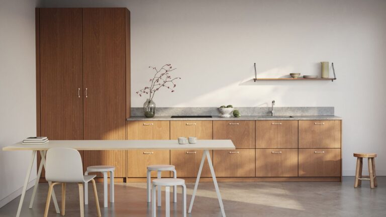
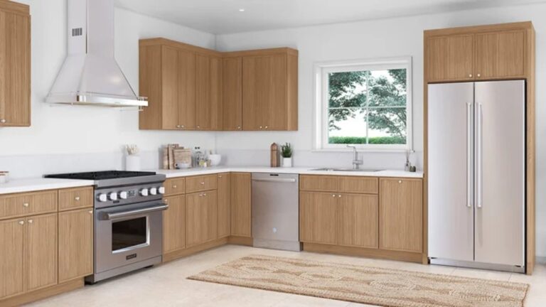
| Natural Wood Veneer | Sinarp, Fröjered, Enköping | Brings 100% unique grain patterns. Will age/darken slightly over 10 years due to light exposure. |
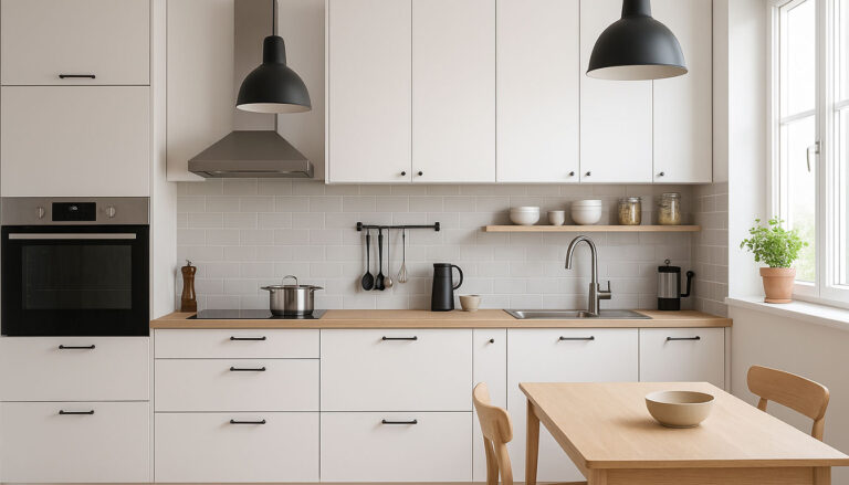
3. Psychology of Color: Warm vs. Cool Strategies
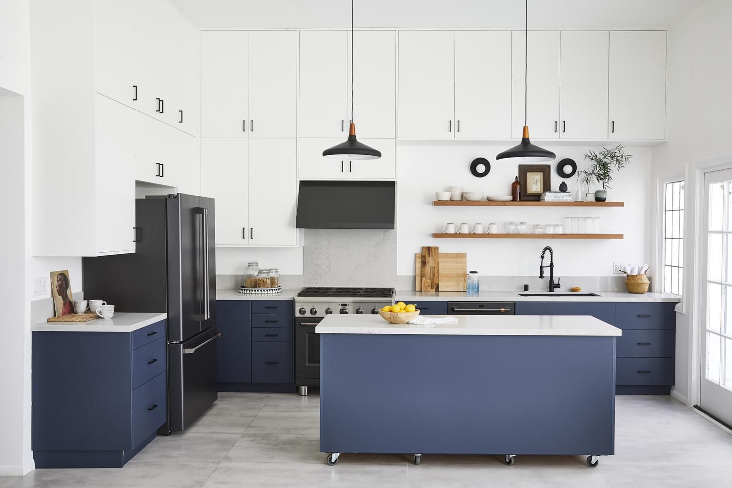
In 2026, the best IKEA cabinet color for your space is one that aligns with your lifestyle. Color psychology has taken center stage in Ontario interior design, moving beyond simple aesthetics into “Emotional Ergonomics.”The “Calm Kitchen” (Cool Neutrals)
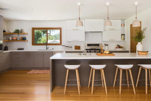
The “Social Kitchen” (Warm Tones)
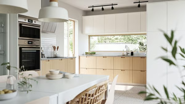
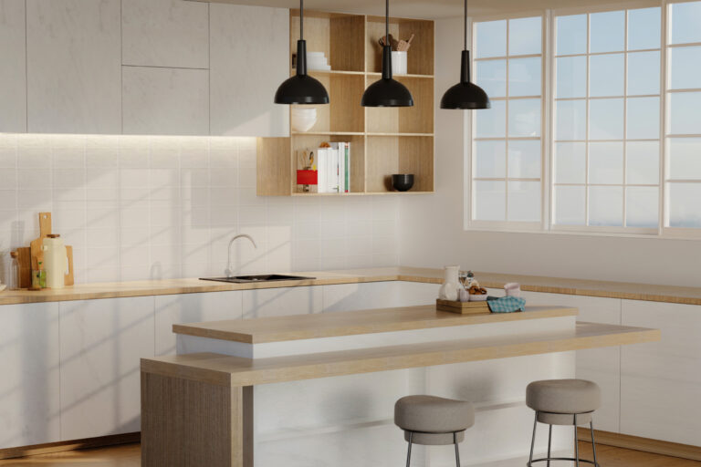
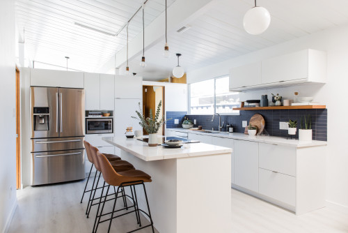
4. Mastering Small Space Aesthetics in Urban Canada
For many urbanites, the best IKEA cabinet color for your space must address the “Condo Squeeze.” In small layouts, every vertical inch counts. Our Kitchen cabinet dimensions guide highlights how 15-inch deep wall cabinets can feel heavy if the color is too dark. To keep a small kitchen airy:Direct Answer: To expand a small kitchen, utilize a “Tonal Monochromatic” scheme. By matching the cabinet color (like Greige or Pearl) to the wall color, you eliminate visual boundaries, tricking the brain into perceiving 20-25% more spatial volume.
- The 60-30-10 Rule: 60% of the kitchen should be a dominant light neutral, 30% a secondary wood or metal tone, and only 10% for a bold “accent” color (like the island or open shelving).
- Reflective Finishes: While matte is trendy, the “Satin” finishes of 2026 offer a perfect middle ground—bouncing light without the dated “plastic” sheen of old-school high-gloss.
- Glass Integration: Using glass-front upper cabinets in a light color creates a “window effect” into the cabinet, adding depth that solid doors lack.
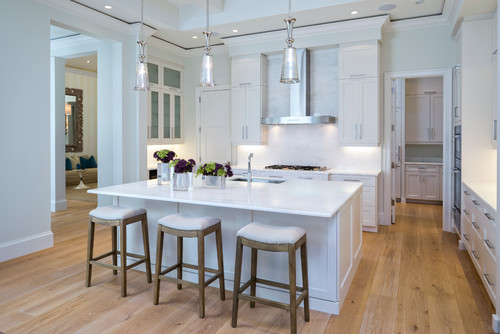
5. Professional Coordination: Countertops, Floors, and Hardware
A color guide is incomplete without coordination. Knowing how to match IKEA cabinet colors with your structural elements is what separates a DIY project from a professional-grade renovation. In 2026, the trend is “Texture Contrast”—pairing a flat cabinet with a highly textured stone.The “Gold Vein” Quartz Revolution
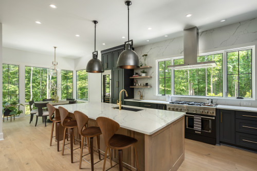
Flooring and the “Grounding” Effect
6. Quality Check: Why Your Color Choice Impacts Durability
It is a professional secret that certain IKEA kitchen cabinet colors are more durable than others. This is tied to the chemical composition of the finish. In our IKEA kitchen cabinets quality audit, we found the following:- Dark Matte Finishes: These look incredibly high-end but are the most prone to showing oils from fingertips. In 2026, IKEA has improved this with “Nano-Clean” technology, but they still require more frequent wiping than lighter tones.
- Painted Lacquer (Bodbyn/Axstad): These have the most “depth” of color but can be prone to microscopic cracks at the joints over 10-15 years due to the natural expansion/contraction of the fiberboard core.
- Thermo-Foil (Veddinge): This is arguably the most “indestructible” color choice. It is a single sheet of plastic wrapped around the door, meaning there are no seams for moisture to enter.
7. The “IKEA Hack” and Hybrid Color Strategies
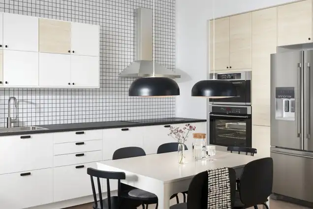
Many 2026 homeowners are choosing a “Hybrid” approach: using the IKEA SEKTION boxes but buying custom-painted doors from third-party manufacturers. This is the ultimate IKEA kitchen cabinet color guide secret. By purchasing the “bones” from IKEA, you save on the box cost, allowing you to splurge on a custom “Farrow & Ball” paint color for the doors. This results in a kitchen that looks like a $60,000 custom build for less than $20,000.However, if you stay within the IKEA ecosystem, the 2026 “Enköping” and “Vårsta” (Stainless Steel) lines allow for industrial-to-organic transitions that were previously only available through custom metal shops. Mixing wood-tone lower cabinets with stainless steel uppers is a growing trend in Toronto’s “Industrial Loft” renovations.8. Maintenance: Keeping Your 2026 Kitchen “Fresh”
Longevity is as much about cleaning as it is about construction. Choosing IKEA kitchen cabinet finishes wisely means knowing your maintenance threshold:- Matte Finishes: Avoid all abrasive cleaners or “Magic Erasers.” They will “polish” the matte into a shiny spot that cannot be reversed. Use only microfiber and distilled water.
- Gloss Finishes: These are the easiest to clean but show every scratch. In 2026, we recommend a yearly application of a specialized polymer sealant to keep the gloss from dulling.
- Wood Veneers: Must be kept away from direct, localized steam (e.g., placing a kettle directly under a wood wall cabinet). The steam can cause the veneer to peel at the edges.
9. Regional Focus: Why Choice Matters in Toronto & Mississauga
In the GTA, real estate is a game of perceived value. A kitchen that looks “dated” can knock $50,000 off a home’s asking price. Our IKEA kitchen cabinet color guide suggests that for homes in high-resale areas like Port Credit or Oakville, sticking to “Transitional Neutrals” (Axstad or Bodbyn) is the safest financial play. For downtown Toronto condos, “Modern Minimalism” (Voxtorp or Kungsbacka) yields the highest return on investment.Furthermore, Ontario’s humidity swings—from 80% in August to 20% in January—impact how we see color. During our dark winters, a kitchen that is “too gray” can contribute to seasonal affective issues. This is why 2026 designs are seeing a massive return to “Warm Woods” and “Soft Creams” that feel cozy when the snow is falling outside.10. Comprehensive FAQ: Color & Value
Q: What is the most “timeless” IKEA color? A: Axstad Matte White. It fits both traditional and modern homes and has remained a top seller for over 6 years because it bridges the gap between styles perfectly.
Q: Do dark cabinets make a kitchen look smaller? A: Not necessarily. If you have high ceilings and good lighting, dark cabinets (like Lerhyttan Black) can create “recessive depth,” actually making the walls feel further away. It’s about balance, not just brightness.
Q: Can I paint my IKEA cabinets later if I hate the color? A: Yes, but it’s difficult. Foil-wrapped doors require specialized primers. It is always better to invest in the right color from the start than to try and “fix” it with DIY paint later.
11. Final Verdict: The 2026 Color Strategy
The choice of cabinetry defines the “bones” of your home for the next two decades. IKEA kitchen cabinets remain the undisputed king of “High-Design, Low-Cost.” They are the perfect solution for modern condos, DIY enthusiasts, and homeowners who prioritize smart internal organization over traditional wood joinery.Ultimately, a well-planned IKEA kitchen, paired with professional coordination and high-end stone counters, is more than just a “budget fix”—it is a sophisticated design choice. By understanding the modular architecture, choosing IKEA kitchen cabinet finishes with an eye for light, and how to match IKEA cabinet colors to your GTA home’s specific orientation, you can build a kitchen that is as functional as it is beautiful.Ready to transform your home with professional-grade cabinetry?
Need a professional second opinion on your IKEA color palette? Request a Kitchen quote and layout from our specialists serving Toronto and Mississauga today. Explore the Best Cabinetry Solutions at rtadepot.ca.Contact us today for a professional consultation: +1 888 973 5636